Report summary
The Summary page, also referred to as the risk analysis report, is the landing page of the report. Its purpose is to give users insight into the quality of a software at a glance, without going into much detail.
From this summary, users of all levels of experience and knowledge are able to infer the risks the analyzed software carries and any evident issues that are cause for concern.
Information on the page is arranged in the top-down approach. This allows users to go from a more general overview of the key risks in the analyzed software to more detailed visual elements with just a few scrolls.
Nearly all elements on the page are interactive, so users can instantly access more details on any information provided on the page. This way, an overwhelming amount of information is not thrown at users and they can promptly identify gaps in a software. They're then able to focus their resources on resolving them, without wasting time searching for the information they need.
Navigating the Summary page
All report pages share a sidebar on the left-hand side, which is used for navigating between different parts of the report. It is always visible, which means you can access it from every category in the report. To focus more on the contents of the report, the sidebar can also be collapsed, which does not hinder the access to the relevant elements.
At the top of the report Summary page, you can find the product name for the package version, its license, time of its last scan, and the scan duration.
Report summary consists of the following sections in the order as they appear on the page:
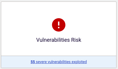
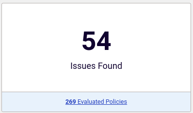
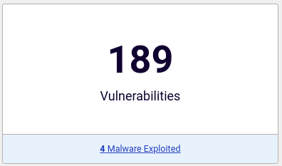
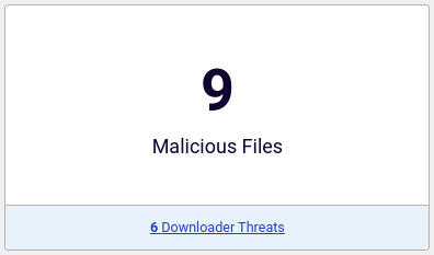
- Summary cards - with the information on the worst detected deployment risks, issues, vulnerabilities, and malware in the analyzed software
- Summary panels - with an overview of key software safety concerns per risk assessment category, SAFE Levels graphic (for the main package version artifact only), and a list of checks performed against all artifacts in the version
- Charts - with visualizations of detected issues, the component age, the vulnerability exploitation lifecycle with most critical vulnerabilities for each stage detected in your software, detected malware, and key risks or safety concerns per risk assessment category
The report Summary for versions on the Portal File Stream and Projects pages share a banner, but differ in the available actions:
for File Stream versions, you can download the binary, export parts of its report in various formats, and move the version to a project of your choice. This banner also shows who uploaded the version to the Portal and when it will be removed from the File Stream
for Projects versions, you can download the binary, export its report (or its parts in various formats), and generate links for sharing that report with people who might not have a Portal account. This banner also shows who uploaded the version to the Portal and how many times has its report been shared.
Users who do not need the entire SAFE report can download only the Summary page in the PDF format for all package versions.
To better understand how this page is organized, use this interactive visualization.
Summary cards
The first thing you see when you open the Summary page are the summary cards right at the top. They show the information on the most critical risks found in the analyzed software. Each card represents a specific risk category.

Deployment Risk
Most critical risk detected in the analyzed software. There are six main risk categories in Spectra Assure. When there are multiple risks from different categories that can be marked as having the worst outcome for the end-user, the following order applies: Malware, Tampering, Vulnerabilities, Secrets, Hardening, Licenses. However, if any reproducibility differences exist or suspicious behavior differences are present, Tampering always takes the highest priority.

Issues Found
The total number of issues detected in the analyzed software, as well as how many policies have been evaluated. The Spectra Assure products evaluate all enabled policies and recognize all policy violations as detected issues. Each detected issue is counted only once per entire package, no matter how many files it's found on. Clicking on the number of evaluated policies at the bottom of the card opens the Policies page of the report with a filter set to enabled policies. The data shown here is illustrated and expanded in more detail in the Issues chart below.

Vulnerabilities
The total number of vulnerabilities found in the analyzed software. Out of all detected vulnerabilities, it singles out the most critical one based on the following priority: Patch mandated vulnerabilities, Malware exploits, Proven exploits, Critical severity vulnerabilities, High severity vulnerabilities, Medium severity vulnerabilities, Low severity vulnerabilities. Clicking on the singled out vulnerability at the bottom of the card opens the Vulnerabilities page of the report with a filter set to the type of the vulnerability. The data shown here is illustrated and expanded in more detail in the Vulnerabilities chart below.

Malware found
The total number of malicious and suspicious components detected in the analyzed software. At the bottom, you'll find a total number of most severe malware threats detected in any component of the analyzed software. Clicking on it opens the Malware page of the report with a filter set to the surfaced threat type. The data shown here is illustrated and expanded in more detail in the Malware chart below.
Summary panels
Under the summary cards, there are panels that help you quickly detect the most critical gaps in your software per risk category, determine the maturity of your software on the SAFE Levels scale, and see what checks were done on all artifacts in the version.
SAFE Assessment
A summary of key risks or safety concerns found in your software. Detected risks are grouped according to their shared characteristics:
- Compliance - Identified discrepancies in your software. Includes license compliance issues (Licenses) and detected sensitive information (Secrets)
- Security - Identified issues regarding the safety of the analyzed software. Includes detected known vulnerabilities (Vulnerabilities) and application hardening issues (Hardening)
- Threats - Identified issues that could cause harm to your organization. Includes evidence of software tampering (Tampering) and evidence of malware inclusion (Malware)
If any entitlement restrictions are imposed on your license, every disabled risk category is greyed out. The data from disabled categories is not included in the report, does not affect the overall CI status, and cannot be accessed.
To better understand the data shown in this section, use this interactive visualization.
For each category, the amount of most critical issues is stated, unless a category is disabled. Clicking on that number opens the Issues page of the report with a filter set to the policy triggered by the reported issue.
This section offers an insight into the amount of policies that have been disabled. It also allows you to see the full list of policies on the Policies page.
SAFE Levels
SAFE Levels provide a guided approach to improving overall software quality by pointing developers to key software safety concerns.
A SAFE Levels graphic is available on the Summary page only for the main artifact, as Levels are not applicable to reproducible build artifacts.

On this graphic, you can see the currently configured level (Scan Level) and the path to the next level your package can attain (Best Level). If the path is clear, Scan Level is highlighted and animated.
If there are issues to resolve, this section indicates their total amount. Clicking on the Fix X issues opens the Issues page of the report with the filter set to the desired level and the Pass CI/CD status.
The amount of issues per category is shown when you hover over each level badge. Clicking on that number opens the Issues page of the report with the filter set to the policies triggered by the selected issues and the Fail CI/CD status.
Scan Level can be equal to Best Level when it's the highest level your package can attain without any changes.
When Best Level is lower than Scan Level, that indicates the actual level your package was able to attain. It cannot attain the currently configured level until you resolve all issues between Best Level and Scan Level.
Performed Checks
Checks performed against all artifacts in the version.
This information can also be found in the Info dropdown for a package version or displayed with the rl-secure checks command.
The following check types can be displayed:
Software package analysis - standard scan of the main package version artifact. Clicking on the Issues text at the end of the row leads you to the Triage > Issues page of the report
Diff with:
<version>- comparison of the main package version artifact with another package version. Clicking on the Diff text at the end of the row leads you to the Version diff > Issues page of the reportSoftware package analysis: repro - standard scan of the reproducible build artifact. Clicking on the Repro Report text at the end of the row leads you to the Audit > Reproducibility page of the report
Diff with: repro - comparison of the main package version artifact and its reproducible build artifact. Clicking on the Repro Check text at the end of the row leads you to the Audit > Reproducibility page of the report
Reproducible build check - functional and behavioral similarity check between the main and the reproducible build artifacts. Clicking on the Repro Check text at the end of the row leads you to the Audit > Reproducibility page of the report
Clicking on the text at the far right of each performed check leads you to the corresponding page. There you can see all detected issues that determine the status of the check.
To better understand the data shown in this section, use this interactive visualization.
The first check (Software package analysis) is the default and always present for all analyzed package versions. Other checks are displayed only if they have actually been performed for a package version.
Every check type is assigned a label that shows the status information (pass or fail) for the check. The first two characters in the label are used to distinguish between check types:
L(n)- software package analysis with SAFE Levels enabledCI- software package analysis with SAFE Levels disabledC(n)- software package analysis with custom SAFE LevelsDF- comparison (diff) between package version artifactsRB- reproducible build check
Charts
The last part of the Summary page are the chart sections.
The Issues, Vulnerabilities, and Malware sections list the most critical risks found during analysis, while the corresponding charts illustrate all detected issues in each category. The data found here expands the information summarized in the cards at the top of the Summary page.
The Component Age graph illustrates the timeline of new components introduced in the software package by year.
The SAFE Assessment Evaluations charts provide more details on each risk category from the SAFE Assessment panel near the top of the Summary page.
Issues
This section surfaces 5 most important software quality issues found during software package analysis.
These issues are selected by priority, which means that the issue with the highest priority is always at the top of the list.
Any disabled policies for your group or organization impact the analysis results. Thanks to the Failed, Suppressed, and Disabled boxes in the very center of the section, it is obvious at a single glance whether the analysis results are accurate or if most of the issues were swept under rug.
The radar chart at the far right of the section illustrates the total count of all issues detected during analysis per priority. This helps you prioritize issues for fixing and evaluate where the majority of your problems lie.
The entire section has elements that allow you to see more details with one click:
- The priority icons next to each issue on the list. This opens the Issues page of the report with a filter set to the policy triggered by the reported issue
- Failed, Suppressed, and Disabled boxes. This opens the Policies page of the report with a filter set either to priority and CI/CD status (in case of Failed or Suppressed) or to policy state (in case of Disabled)
- The priority icons on the radar chart. This opens the list of issues that have that priority on the Issues page of the report
- Total Issues count below the radar chart. This opens the list of all detected issues in that software package version
- All Issues in the upper right corner of the section. This also opens the list of all detected issues in that software package version
Component Age
This section visualizes the timeline of when each detected component was introduced into the analyzed software package. The information about component age helps you assess the potential for software decay and understand how introduced risks are distributed over the years.
The most likely age of a component is calculated by taking the oldest date from the following:
- When the file was first seen in the ReversingLabs Cloud
- When the file was compiled (excluding reproducible builds)
- When the file was created or modified on the filesystem (archives and disks)
- When the file was signed and countersigned for time-stamping
The chart then groups components by year in which they were introduced, with each bar representing the total number of components for that year. Components whose the age could not be calculated are grouped together in the "Undetermined" bar that shows a question mark ("?") instead of a year in the chart. Years in which no components were introduced are excluded from the chart.
Hovering over the bars in the Component Age chart shows more information about components and associated risks. For every year, the hover tooltip indicates the number of introduced components, components causing risks, and risk breakdown (failed, warned, or passed).

The overall component age estimate is always displayed next to the section title in the format "50% components were introduced before Month Year".
This helps you determine if the majority of the components - and the risks they caused - are older or newer than a specific point in time.
Components with undetermined age are excluded from this estimate.
The All Components link in the upper right corner of the Component Age section opens the Audit > Components page in the SAFE report. When you select any component in the SAFE report (on the Components page or in the Bill of Materials), the component age is listed among other file information.
Vulnerabilities
A visual representation of a vulnerability lifecycle.
Ideally, this graph should show as few issues as possible on its right-hand side, since the red-colored phases are considered cause for concern. The graph consists of the following four stages:
- CVE Discovered - software composition analysis has identified one or more known vulnerabilities
- Exploit Exists - available threat intelligence telemetry has confirmed that the reported vulnerabilities are actively being exploited by malicious actors
- Exploited by Malware - available threat intelligence telemetry has confirmed that the reported vulnerabilities are actively being exploited by malicious actors. Malware code that propagates through these vulnerabilities has been created
- Patching Mandated - vulnerabilities are in the CISA Known Exploited Vulnerability (KEV) catalog
For each stage, you can see the top 3 vulnerabilities based on their severity. This means that known vulnerabilities of high and critical severity get propagated first. Upon hover, you can see the entire CVSS score and information for every detected vulnerability on that list.
A total count of detected vulnerabilities is also available for every phase, along with the amount of vulnerabilities that can be fixed by updating the dependency to the newer version. Some vulnerabilities can belong to multiple categories and as such, they contribute to the total number for every category.
The entire section has elements that allow you to see more details with one click:
- Total number of active and triaged vulnerabilities detected in the analyzed software. This opens the Vulnerabilities page of the report
- All Vulnerabilities in the upper right corner of the section. This also opens the list of all detected vulnerabilities in that software package version
- Each CVE ID and the severity icon next to it. This opens the Vulnerabilities page of the report with a filter set to the CVE ID of the vulnerability in question
Malware
This section surfaces 5 most severe malware threats found during software package analysis.
These issues are selected by threat factors and are ranked from worst to least severe. Their severity is determined by the type of every detected threat. A bar chart at the far left of the section sorts these malware threats by count and threat type.
Show / hide supported threat types
Spectra Assure detects the following threat types, ordered alphabetically:
Adware
Backdoor
Browser
Certificate
Coinminer
Dialer
Downloader
Dropper
Exploit
Format
Hacktool
Hyperlink
Infostealer
Keylogger
Mail
Malware
Network
Packed
Phishing
PUA
Ransomware
Rogue
Rootkit
Spam
Spyware
Trojan
Virus
Worm
To view the list of all detected malicious and suspicious components in that software package version, select All Threats in the upper right corner of the section.
To better understand the data shown in this section, use this interactive visualization.
SAFE Assessment Evaluations
This section clearly illustrates the relationship between policies, policy violations, and risks.
The charts found here provide more details on each risk category from the SAFE Assessment panel at the top of the Summary page. For every category, the corresponding chart shows the following data:
- The name of the category and its status
- The total number of evaluated policies in the category. If any policies in this category have been disabled, you can view them by clicking the greyed-out text. To view all enabled policies for the category, select the number of evaluated policies. Both actions take you to the Policies page
- How many policies out of the total number of evaluated policies have failed, triggered a warning, and passed. If data for any status is missing, that status won't be shown
- The total number of detected risks in this category
- Top 3 risks that caused the warning or failing status for the category. If more risks are available, you can see the full list by clicking on the text below
To better understand the data shown in this section, use this interactive visualization.